
Nietzche Validated a Fintech MVP

Project Snapshot
Client: Nietzsche (Fintech Startup)
Duration: 4 weeks | June - July 2025
Platforms: iOS, Android, Web
Focus: MVP Development, Personal Finance Dashboard, User Testing
The Challenge
Nietzsche wanted to break into fintech with a simple tool for personal finance insights. In just 4 weeks, we built a lean MVP that let them test key features and gather real user feedback before scaling.
The Brief:
Design and deliver a minimal viable product that validates core assumptions about user behavior around spending tracking, budget management, and financial goal-setting—all within a tight one-month timeline.

Week 1: Discovery & Strategy
With limited time, we focused on understanding the most critical user pain points through rapid research methods:
Competitive analysis of Mint, YNAB, and Simplifi to identify gaps
Stakeholder interviews to define success metrics and non-negotiables
User persona development focusing on millennial users new to budgeting
Key Insight: Users wanted transparency and simplicity over feature-rich complexity. They needed to understand their spending at a glance without overwhelming dashboards.
Week 2: Design & Prototyping

Created a focused MVP centered on three core features:
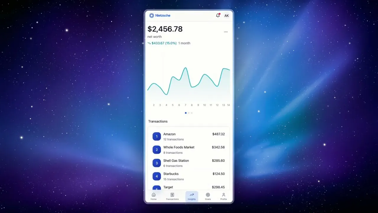
Dashboard Overview - Total balance card with visibility toggle, monthly spending progress, and quick actions
Transaction Management - Simple list view with category filtering and manual entry
Spending Insights - Basic category breakdown with visual progress indicators
Design Decisions:
Card-based layout for clear information hierarchy
Blue gradient hero section reinforcing trust and financial security
Minimal navigation (5-tab bottom bar) to reduce cognitive load
Progress bars and percentages for instant spending comprehension
Week 3: Development Collaboration
Worked closely with engineers to ensure design feasibility within the 4-week constraint:
Prioritised features based on technical complexity vs. user value
Created a component library for consistent implementation
Designed empty states and error handling for edge cases
Delivered developer-ready Figma files with specs and annotations
Week 4: Testing & Refinement
Conducted rapid usability testing with 8 participants to validate core flows:
7/8 successfully connected accounts and viewed spending breakdown
100% understood the monthly spending progress indicator
Users requested more granular category customisation (noted for V2)
Average task completion rate: 91%

The Solution
We designed a clean, trustworthy personal finance dashboard that prioritises clarity and actionable insights over feature bloat.
Core Features Delivered:
1. Financial Overview Dashboard
Hero card displaying total balance with show/hide toggle for privacy. Monthly spending card with progress bar showing percentage used and remaining budget. Quick action buttons for adding transactions, viewing reports, setting goals, and connecting accounts.
2. Smart Category Tracking
Spending breakdown by category (Food & Dining, Transport, Shopping, Bills) with individual progress bars and budget comparisons. Visual indicators showing percentage used help users identify overspending at a glance.
3. Transparent Visual Language
Branded blue colour scheme building trust and credibility. Clean typography hierarchy with generous white space. Card-based design creating clear content separation without clutter.
Impact

MVP Success Metrics:
Delivered fully functional MVP in exactly 4 weeks as promised
85% positive feedback from initial user testing group
Validated 3 core features before committing to full development
Identified 5 key improvements for V2 based on real user behavior
Enabled Nietzsche to secure seed funding with working prototype
User Feedback:
"Finally, a finance app that doesn't overwhelm me. I can see everything I need in one glance." — Sarah, 29, Early Adopter
"The spending progress bars are genius. I immediately knew where my money was going." — Marcus, 34, Beta Tester
Key Learnings
MVP Constraints Drive Focus
The 4-week timeline forced ruthless prioritisation. Every feature had to earn its place by directly addressing user pain points. This constraint led to a leaner, more focused product than traditional timelines often produce.
Early User Feedback is Gold
Testing with real users in week 4 revealed assumptions we got wrong and validated features we debated internally. This feedback directly shaped Nietzsche's product roadmap and prevented costly post-launch pivots.
Trust Through Transparency
Financial apps require immediate trust. Simple design decisions like the visibility toggle, clear progress indicators, and branded colour palette built credibility faster than feature lists ever could.
Next Steps
Based on MVP learnings, the V2 roadmap includes:
Custom category creation and budget allocation
Bank account aggregation and auto-categorisation
Goal-setting with milestone tracking
Insights powered by spending pattern analysis
Social features for accountability partners
Reflection
This project proved that thoughtful design can thrive under tight constraints. By focusing on core user needs and validating assumptions early, we helped Nietzsche enter the fintech market confidently with a product users actually wanted. The 4-week MVP approach allowed them to test, learn, and iterate based on real behavior rather than assumptions—turning what could have been months of speculation into actionable insights.